

Redefining Reunion
Mooncakes for the Living and the Dead
A tradition celebrated by many, the Mid-Autumn Festival is all about lunar appreciation with our loved ones. This season also allows one to be reunited with their family members, bonding and enjoying one another’s company.
This is great. But what about the ones who left us?
Using this project, we redefined the meaning of what a reunion can be and extend the celebrations to the dead as well as the living.

[Under The Moon]
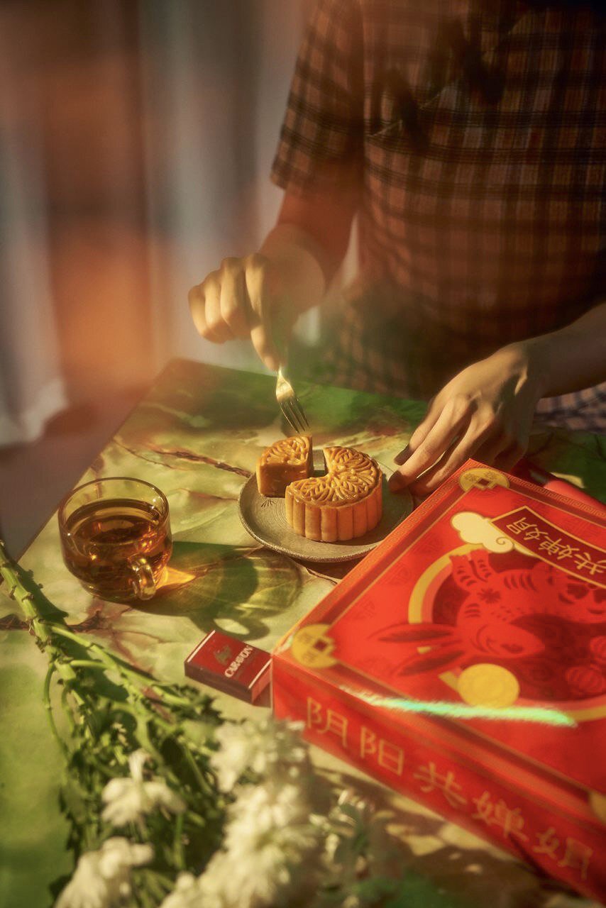
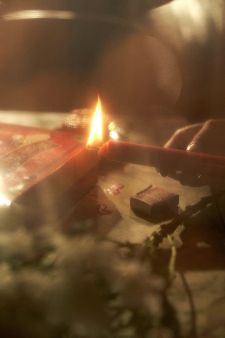
A concept video that shows a blend of dining with the living and the dead.
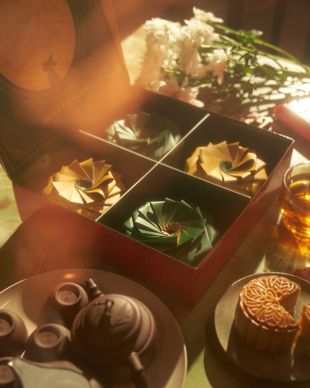
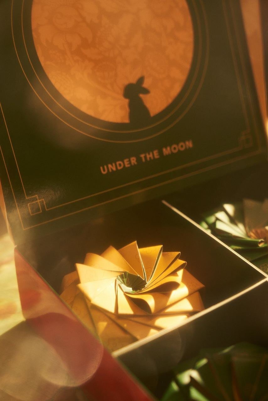
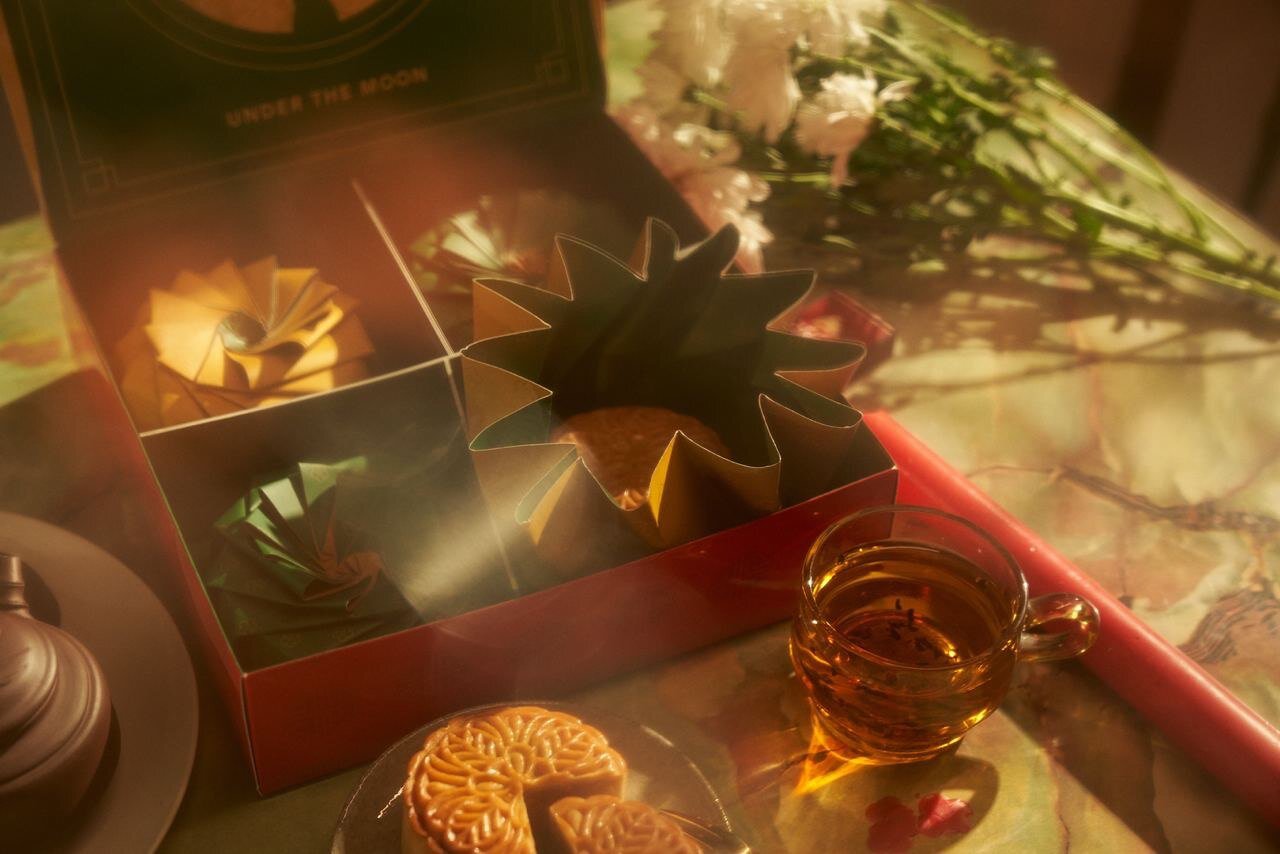
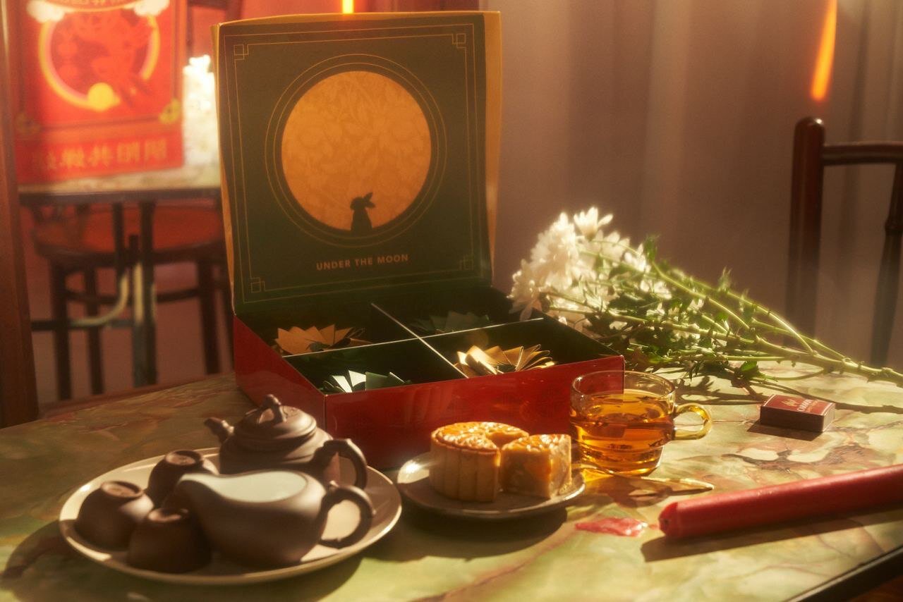
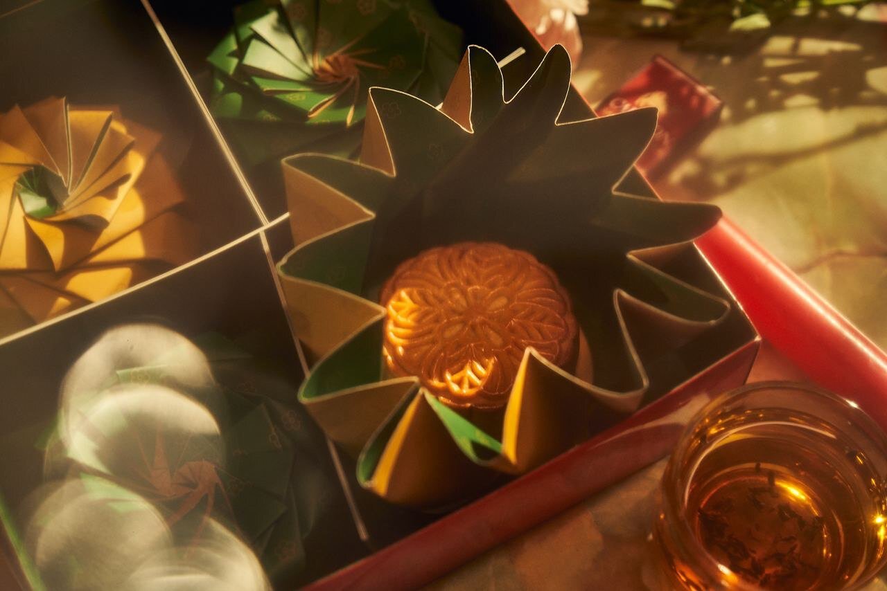
From scratch, we designed and created a mooncake packaging that can be enjoyed by the living and the dead. With a traditional Chinese design exterior look of how Mooncakes Boxes were originally designed and an interior that has a sleek and modern design, we seek to explore the dualities of life & death, modern & traditional, happiness & sadness.
Our goal is to present harmony amongst these opposing themes.
Art Direction
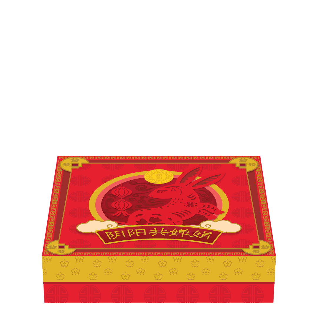
Inspired by the 1980’s era of Singapore’s time, this project aims to bring a sense of nostalgia and familiarity to an unconventional product with an unconventional message. The exterior of the box was designed in Red & Gold that represents loudness with a hint of traditional designs. As for the interior of the box, Emerald and Gold were chosen to represent a more youth design.
The colour Gold was chosen on both the exterior and interior of the box because we believe that it is a colour that signifies everlasting time, binding what is Traditional (exterior of packaging) in contrast to Modern(interior of packaging).
Traditional & Meaningful
Designed in Gold and Red, the box carries the essence of a traditional mooncake boxes with the golden coin and an iconic rabbit with the label “阴阳共婵娟”, the harmonious of dining between the living and the dead.

Mondern & Youthful
Designed in Gold and Green, the box has a modern and minimalistic touch to it. It also holds the packaging for the mooncakes.

Design reference from Brandon Sim, Winner of the Crowbar awards(Silver): The brown wrapper with patterns, that looks like a mooncake when folded up.

The set was designed to create this exact feeling of nostalgia which gave an easy point of reference for Singaporeans to draw a relation to the past where tradition was more widely followed.
At Tristeps Studios, we aim to re-invent the way we think about traditional cultures and practices through our art pieces and works. We love to design intuitive packaging and capture the essence of how it is being applied in our modern-day society.
Besides weaving in a strong art direction, we also specialise in Food Videography and Photography.
Feel free to contact us if you’re looking to create some stunning visuals today, and head down to our Instagram for more of our works.